Here's my take on the "rainbow" trend. I used the adorable butterfly from the new set A Garden (just one of several new A-size sets!), and the sentiment from March's upcoming Stamp of the Month set, Potential. I colored the edge of the butterflies' wings with the markers (left to right): Tulip, Sunset, Sunny Yellow, Pear, Sky, Gypsy and Cotton Candy. Then I filled in the inside of the butterflies' wings with small polka dogs made with our Black marker. Too cute! I loved how they turned out. The paper is a print from the new Stella paper packet, and I added some black polka dots to it as well to tie everything together.

Then I was playing around with some of the hot color trends. I am lovin' the yellow/grey combination right now. This card was one of the make-n-takes at the Open House, and everyone thought it was adorable. The colors are Grey Wool and Honey. I cut the cute little banner pieces with our Cricut Art Philosophy cartridge, of course, and strung them on our brand new Baker's Twine -- the Grey Wool from the Neutral Assortment. I think our new Baker's Twine assortments are my favorite new embellishments! I used the sets Bingo Alphabet and the sentiment from A Tree along with Diverse Backgrounds. I used the polka dot pattern from Diverse Backgrounds to stamp the butterfly. The paper is a print from the new Pemberley Paper Packet.

Another color trend I played around with is the new brights, especially with orange! This one also is a take on the color block fad that is so hot right now. I used Sunset, Cotton Candy and Sunflower, and I must have selected a good combination as my daughter adored these colors (orange is her favorite color). I wanted chunky blocks with my color, and I used a sentiment from the upcoming July Stamp of the Month set, Live Out Loud. I added some bling with our Rhinestone designer brads and the new Sparkles Flourishes. I've used similar products from other companies to our Sparkles Flourishes before and some have been difficult to apply, keeping the shape. These went on so easy, and I had no problems keeping those beautiful graceful flourishes when attaching them to the card.

Another trend that is hot right now is mixing patterns! I personally, have always loved to do that anyway, so it was a lot of fun to put together this scrapbook page. I used a print each from the new paper packs Stella and Lucy as well as from the Typeset paper pack. I know many of you are scared to mix patterns (if they aren't already matched together in a paper pack), but don't be afraid to "mix things up" and grab different patterns from different packs! One of the main things to pay attention to is the scale of the pattern -- make sure that you are balancing out a large, bold pattern with a smaller print -- have some contrast. Here I chose my colors from the photo, but if you have an underlying color in all the patterns that will also help you blend your patterns together in a visually pleasing way. Trust me, it's fun! Make sure to try it. I went to town with a lot of embellishments on this page. The title is using the Eclectic Alphabet chipboard letters, with resist patterns on them! All I had to do was sponge on the Cotton Candy ink. Then I used some more Baker's Twine, sewing a border around the edge, this time with the Lagoon color from the Paradise Assortment. Then that led me to getting out the new Paradise Paper Flowers, which coordinated so well with everything else. Then to keep the embellishments from getting too visually overwhelming (and overshadowing the sweet photograph, which I did not want)... I kept all the remaining embellishments pewter-colored. I pulled some accents from our Pewter Mini-Medley Accents Collection, as well as using our Pin Clips and new Pewter Badge Buttons.

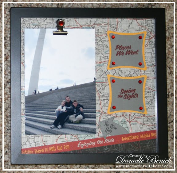
And, last but not least, I was so happy to see the map print in our new paper pack Cruisin'! I have seen so many cute projects with maps, that I knew I had to make something with that print. I ended up getting out a square frame that fit an 8"x8" design. Using sentiments from our new Adventure USA stamp set, more from the Cruisin' paper pack and an arrow from the Cricut Art Philosophy cartridge, I created an 8"x8" layout to fit behind the glass. I made sure to leave room for a regular 4"x6" photo. Then I used one of our new Binder Clips and hot glued it to the outside of the glass! Then, since it seems you can never have enough bling, I added a sparkle to the Binder Clip to tie it in with the sparkles in the layout. Now, I can easily switch out the photo in a snap so I can show our latest trip without having to take apart the entire frame. Nice, huh?
If you haven't yet gotten your new Spring/Summer 2012 Idea Book, what are you waiting for? There is way too much in this one to miss out on, so make sure to contact me today. :-)
Dani
No comments:
Post a Comment